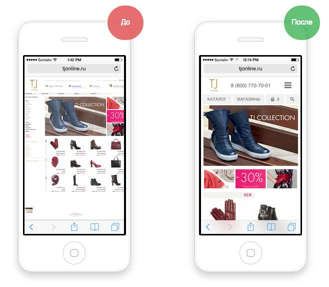
To ensure that a website generates more revenue and attracts a target audience through stable traffic growth, it is important to create a quality mobile version. Of course, responsive design has not been canceled. But a separate version for mobile devices will work much better. There are objective reasons for this.
Benefits of a Mobile Website Version
In our time, computer technology is present in all areas of modern life. We are used to solving household and professional tasks through the World Wide Web. Many people refuse to go to stores, cafes, preferring online shopping, and address delivery services. Remote interaction saves time and money. This is a fact.
With the growing popularity of mobile gadgets, smartphones, and tablets, mobile Internet users prefer to browse websites through them.
This means that developers should pay increased attention to the quality of displaying content not only on stationary PC monitors but also on mobile screens with lower resolutions. To achieve the optimal result, it is impossible to do without a mobile version of the site. At a minimum, it is necessary to take care of responsive design pages.
Do not underestimate the importance of this issue.
As evidence of the importance of a mobile version of the site, we offer to familiarize yourself with the statistics:
- More than half of Internet users search for goods/services and information from mobile devices;
- Over 40% will go to a competitor's site if the chosen site does not have a mobile version.
Representatives of the leading search engine developer Google claim that sites without a mobile version have low ranking performance when searching from mobile devices.
These are not all arguments in favor of a mobile version of the site.
The benefits include:
- Convenience for users. In the conditions of modern busy life, people try to solve as much as possible with the help of a mobile device. They use it on public transport, in traffic jams, etc. There is much less time for a laptop;
- Expanded possibilities. In recent years, mobile marketing has become very popular, which can only be used for certain versions of websites;
- Direct interaction. By viewing the site from a smartphone, the customer can immediately contact the supplier of the desired goods/services or place an order through a special form.
We hope that the arguments presented have convinced you of the need for a mobile version of your website. Now let's talk about the parameters and functional capabilities.
Technical parameters of the mobile version
Once the development work on the mobile version of your site is complete, it's time to think about the correctness of the technical settings.
Make sure that:
- robots.txt allows scanning processes of JavaScript and CSS. They determine display parameters;
- pages of the project send a server response in the form of HTTP code - 200 OK. A non-existent page is displayed as an error 404 (not found);
- the viewport tag is specified. The correct display of content depends on it;
- Flash elements are not used. Most modern smartphones are not designed to work with them;
- the Applet and Silverlight plugins are disabled;
- interactive data is created using HTML5. The correctness of their operation depends on this;
- the text size adapts to the display resolution of the specific device - this is necessary for convenient playback of content;
- if the mobile version is developed independently, redirection should be done using a redirect (302). A 301 may cause system failures.
These simple rules will help you create a mobile site that takes into account the size, functionality, and other parameters of most modern gadgets.
Usability
This term implies the convenience of using the site's functionality to solve tasks.
The mobile site must have good indicators for this parameter, as it affects convenience and, accordingly, targeted actions.
We recommend using some tips and eliminating common mistakes:
- Limit yourself to concise capture forms. Not every visitor will want to scroll the page to find a order form or feedback. It's inconvenient from mobile. In addition, a person will not be able to double-check the correctness of the entered data in one scroll. It is recommended to divide the application into several stages with 4-5 fields that fit the screen size.
- The corporate phone number should be indicated with the country code. It doesn't need to be represented in image form. It is best to write the number in full so that the user can click the button and make a call. In this case, active buttons work well.
- Select the optimal font size, set the margin. The minimum font size for important information is 16 px. The margin on the edge is about 15 px. These are the optimal configurations for comfortable reading of text from a mobile device. Too small font can turn into a mess.
- Buttons for targeted actions should be clearly visible and easy to press with the touch screen. Small buttons force a person to make an effort to perform a particular action. For example, a 44 pixel button will be much more convenient than a 22 pixel one.
- Connect the autocomplete function. This is a very useful option in terms of saving time required to enter personal data, contacts, etc. The user will definitely come back again.
When developing a mobile version of the site, it is important to consider a few more nuances:
- The interval between interactive objects should be at least 27 pixels;
- The website menu with a link to the main page should be located on the launch screen;
- Adjust the option for easy scrolling and text zooming;
- Remove pop-ups and unnecessary banners that create interference in accessing thematic functionality. Such distracting factors can be the reason why a visitor leaves the website;
- When placing video material, provide access to full-screen viewing mode.
To avoid typical mistakes, it is worth paying attention to a special plugin designed for developing a mobile version of the project. For example, WordPress contains template sketches that may have shortcomings. If the result is of paramount importance, it is better to turn to professionals.
Additional
In addition to a mobile version, you can consider creating a website with an adaptive interface. This refers to a resource where page parameters are adjusted to the user's device.
To make the right choice, it is necessary to compare the pros and cons of each option.
Advantages of a mobile version
- Ease of use - due to the presence of only necessary options. Information is provided in a concise form;
- Speed of creation. If the main website already exists, then it is enough to create its simplified version;
- Accessibility. A visitor can go to the expanded version at any time to search for the necessary information.
The downsides include the need to use a separate email address and limited capabilities.
The advantages of a website with an adaptive interface are:
- convenient development;
- one email address.
There are more downsides here:
- information overload when viewed on mobile devices;
- slow loading speed due to large file size;
- lack of a preview function.
When choosing a mobile version, there are a few more things to consider:
- The need for a separate URL. This indicator affects the search engine friendliness. Resources should be treated as two different websites;
- Videos and images should have a small size to ensure the website loads quickly;
- The number of menu transitions should be minimized, as it is not convenient to perform these actions on mobile devices. To enable visitors to perform desired actions, they should only require a few clicks;
- Ensure that there are footers for smartphones and links to target pages of the main resource. With the correct configuration of the redirection function, with attributes specified, search engines will consider your resource as potentially friendly. This eliminates the risk of being banned.
Conclusion
Mobile versions of websites are the optimal solution in many aspects. In addition to attracting traffic and target audiences, this solution will provide a good basis for search engine optimization. The fact is that search engine algorithms perceive such sites positively.
The key to success is a responsible approach and professionalism. Only in this way can you achieve a high-quality result.
As you can see, a website for mobile devices is more prioritized in all aspects compared to a project with an adaptive design. In any case, success depends on the approach. To make the website popular and search engine-friendly, it is important to ensure the correct configuration of both technical parameters and usability.
A mobile version of the website should have the following important qualities:
- User-friendly;
- Universal and practical;
- Uninterrupted page loading;
- Basic functionality.